The Big Idea, Thoughtful Experience (BITE) Project.
As one of the three founders of The Bite Project, I played a key role in shaping the vision, values, and unique identity of this one-of-a-kind creative event agency. I was the driving creative force behind the brand, leading its development, marketing strategy, and implementation. I also oversaw the creative team, ensuring every piece of work reflected our unique approach and high standards.
It was a new approach to the traditional event agency partner model focused on building a thoughtful, strategic, and hardworking project team. The company grew to be a strong player in the B2B and B2E events and experience space, winning and delivering projects for global and Australian businesses such as Toll Group, Metricon, Vanguard, Jeep, Alfa Romeo, EnergyAustralia, and Atlassian.

About the brand design
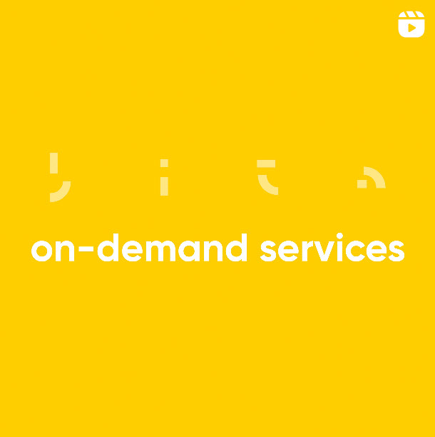
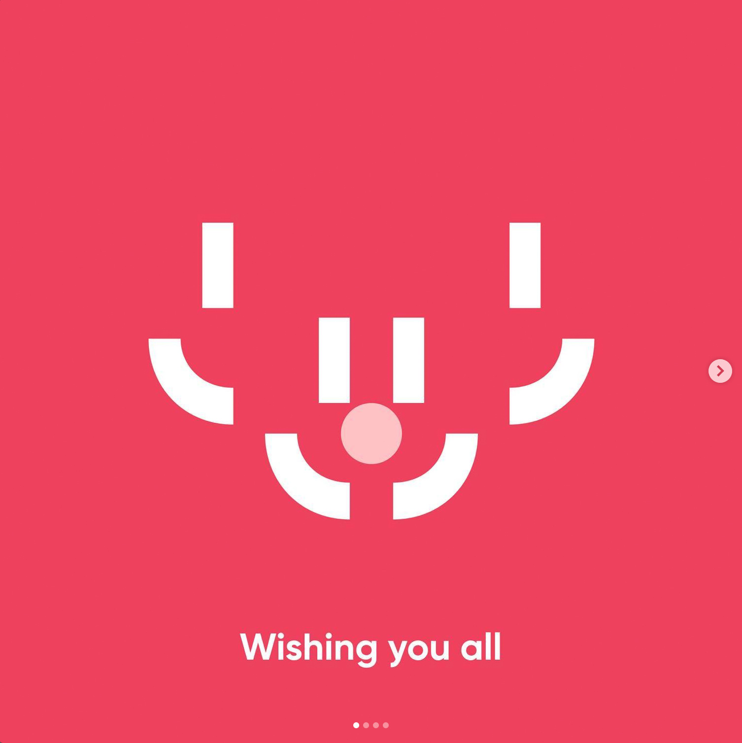
The brand language was built around the 'BITE' acronym. Designed with sections missing, bitten away, but enough left behind to communicate effectively.
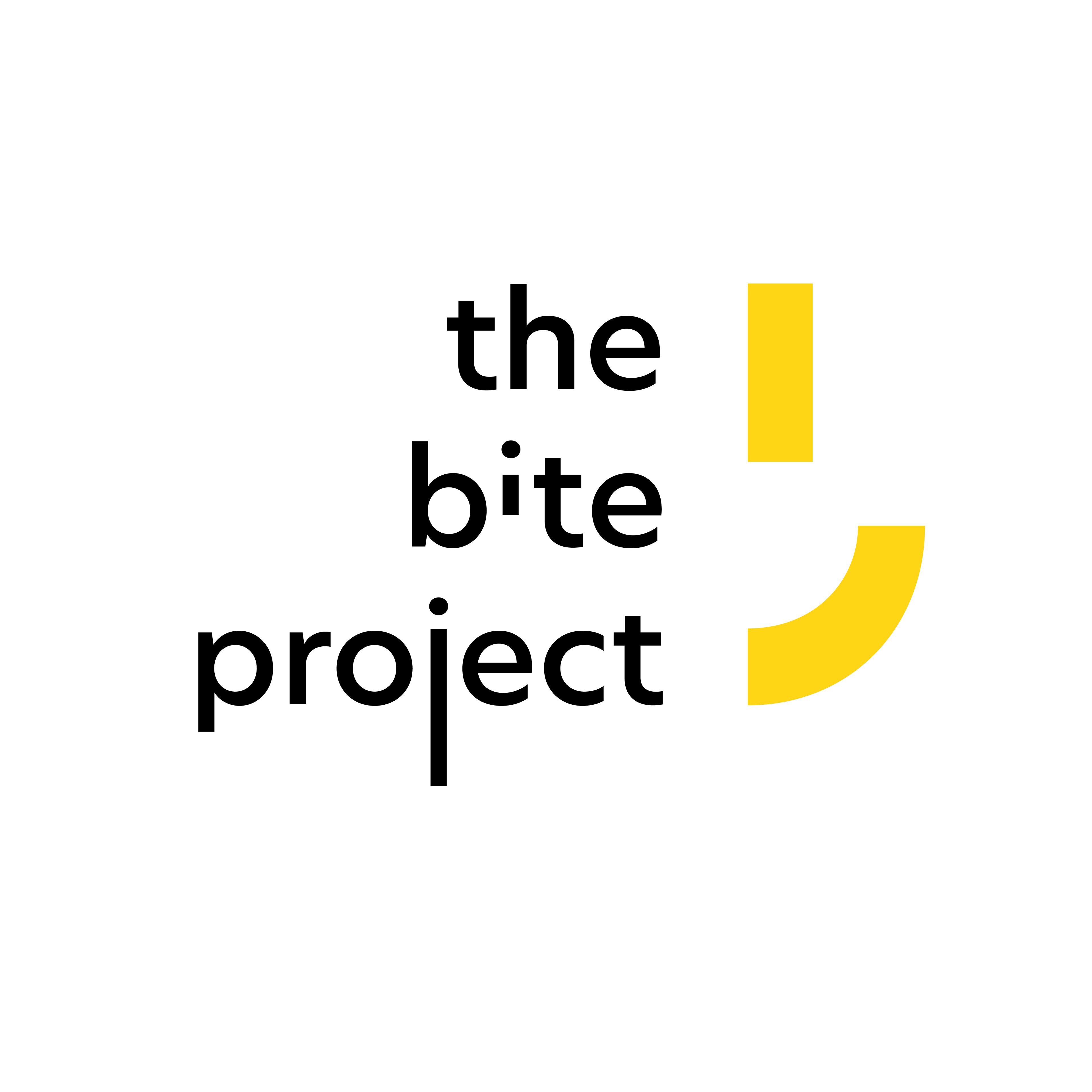
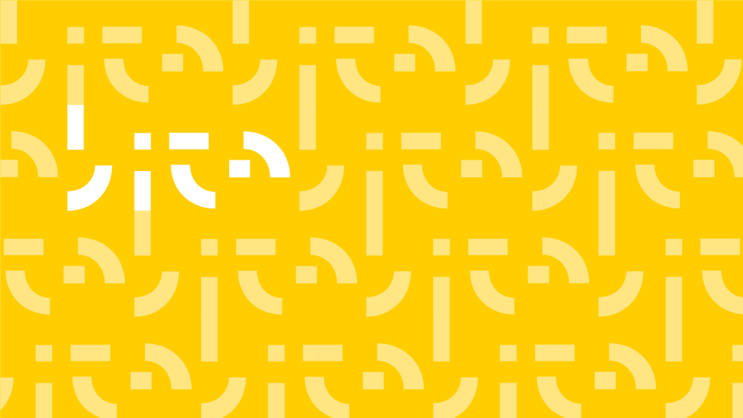
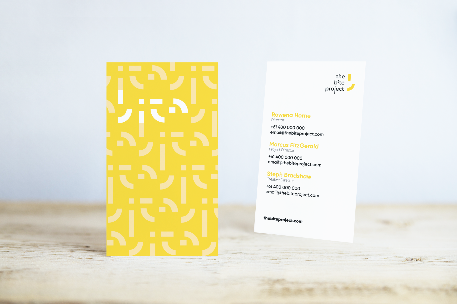
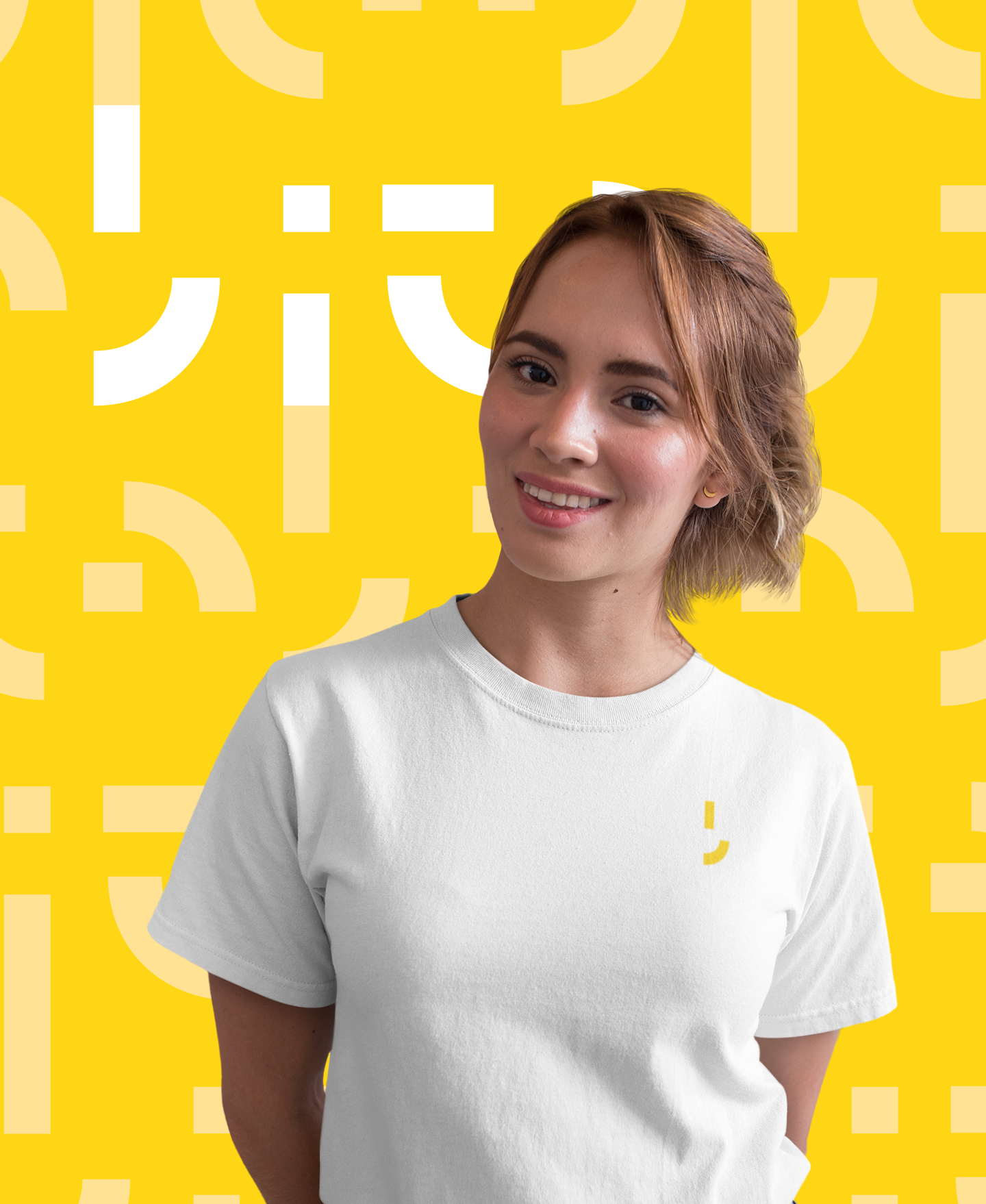
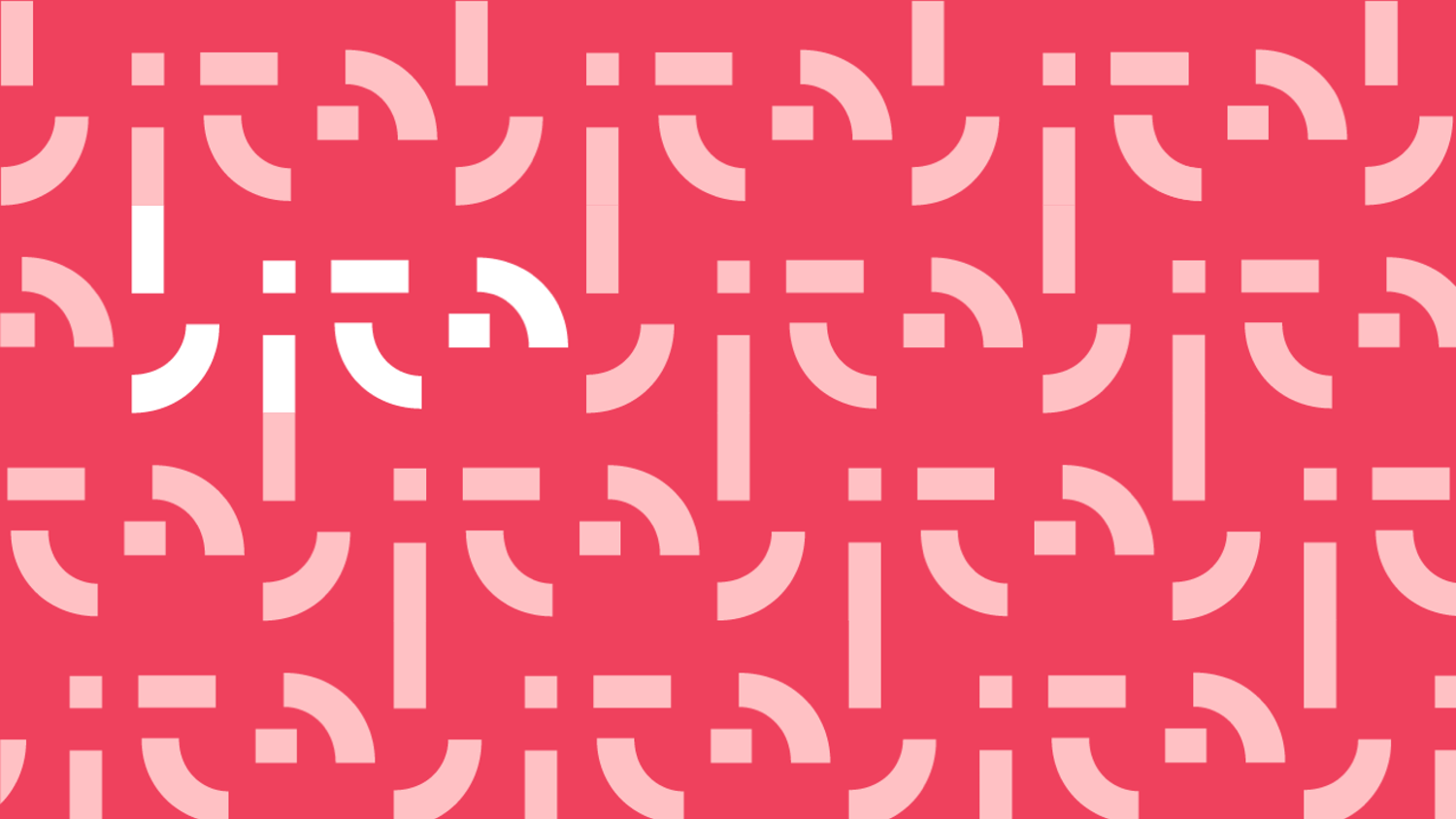
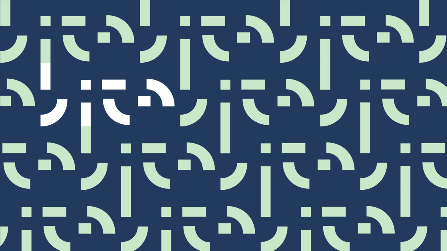
The logo is a letter 'b' and also half a smiley face, sections missing as if bitten way. A 'bite' pattern was created using this 'b' and custom font letters for 'ite'. This pattern and its shapes are used in fun ways to create distractions and pops of colour, and enhances the experience of the brand by creating something for the viewer to decipher.
'The Bite Project' font also has sections bitten away. The curve of the 'j' and the bottom of the 'i' have been snacked on. The wordmark design has been kept clean making it easy to read even with all the playful extractions. The overall effect is curious and thoughtful. Just like the company.
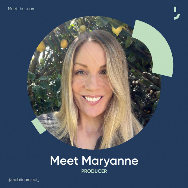
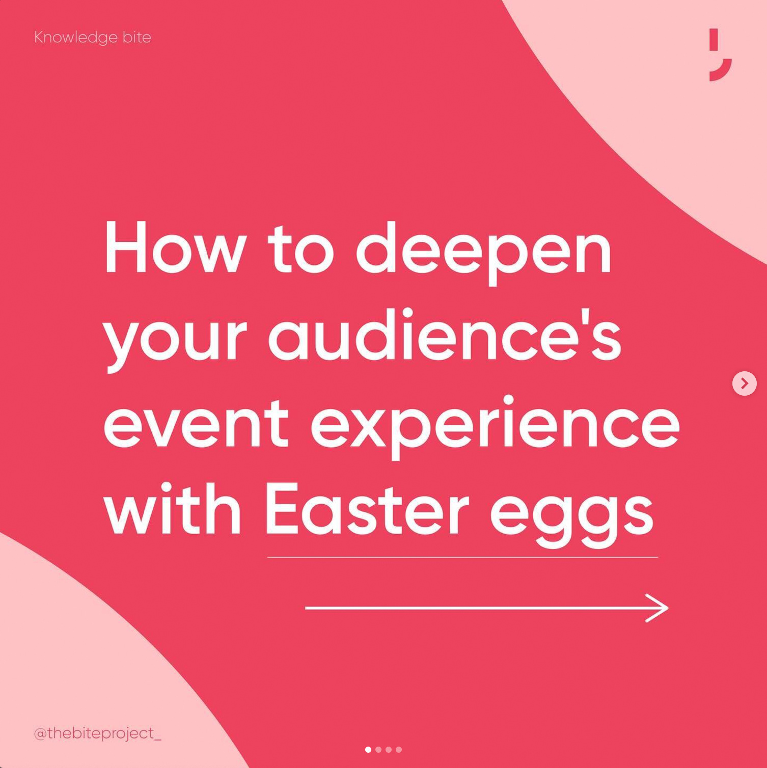
The brand has 3 colourways. Yellow - the primary brand colour is optimistic, enthusiastic, bright and perceptive. It represents the organisation's strategic thoughtfulness. There is a red/pink colourway to represent the creativity in the organisation. Red implies big, bold ideas and passion, while pink is the subtlety and nuance required for great creative work. Finally, there is a blue and mint colourway used for the production area of the business. Blue is for steadfast and reliable delivery while mint is cool, calm and collected. Both have a measured assurance about them.
The tone of voice created represented the personality of the brand; light, thoughtful, no fuss, playful at times and genuine. It sought to disarm and be approachable. Words kept simple and casual, and sentence structures conversational.
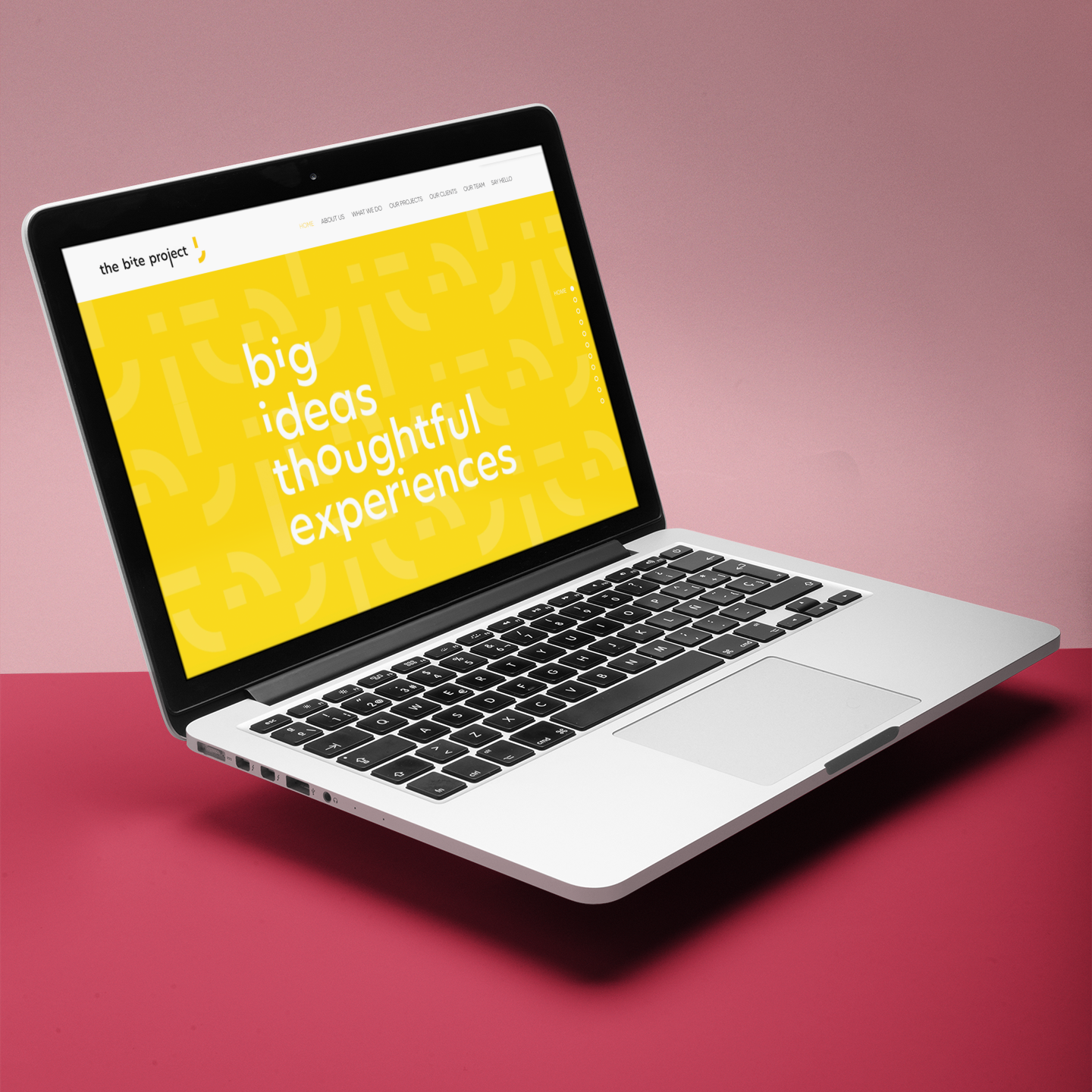
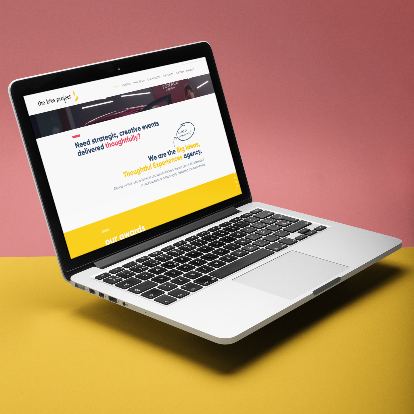
The brand was implemented across all business touchpoints; marketing materials, company templates, social media, website and signage.

